
What to fill in
| Bracket | What to put | Example |
|---|---|---|
| [object short description] | What it is, plus the one or two features that make it recognizable. | "a lighthouse, keep the red and white stripes and the glowing top" |
When do you use it?
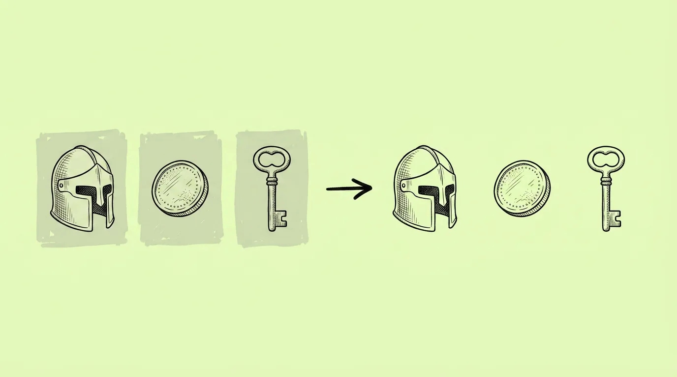
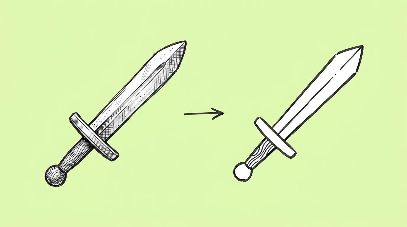
When the detailed art already exists and a small version is needed. A new building needs a map marker. A reward needs a notification badge. A store item needs a shop icon. Shrinking the render doesn't work: at 64px, detail turns into noise.
What breaks, and how do you fix it?
The icon loses what makes the object recognizable. Or it keeps too much detail and still doesn't read small.
- Name the one or two features that must stay. The silhouette plus one signature detail is usually enough.
- Check the icon at its final size. Judge it where it'll live, not at full screen.
- Save your icon rules as a skill. Every future icon matches the set.
Which tool should you use?
Use Genie's agent to simplify the asset into an icon. Need it sharp at any size? Run the result through the vectorize app to turn it into a vector that scales to any size without losing quality.
Variations to try
Turn the attached building into a flat map marker icon, front view, bold outline, two colors plus white.
Turn the attached item into an icon in the same style as the other attached icons.
FAQ
What size should I design for?
+
Check at the smallest size the icon will appear, often 48 to 64px. If it reads there, it reads everywhere.
Can I get a vector file?
+
Yes. Run the icon through the vectorize app.
Does it work on characters?
+
Yes, for avatars and badges. Name the features that make the character recognizable, like hair shape and colors.